INTRODUCING COLOR THEORY
|
|
We're going to watch the first section of the video to the left, through 7:30.
You should be able to answer the following questions: 1. What is saturation? 2. What happens to a color when you make a shade of that color? 2. What happens to a color when you make a tint of that color? |
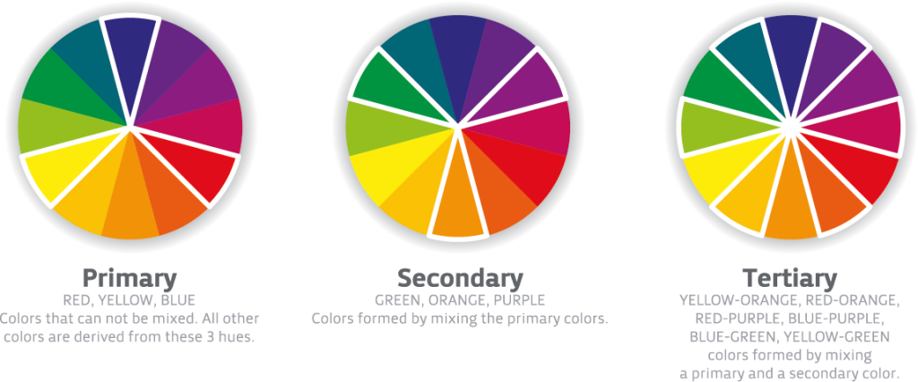
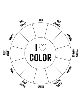
COLOR MIXING - Creating a color wheel
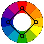
The primary colors are red, blue, and yellow. They can NOT be mixed. They must come straight from the bottle. The secondary colors are orange, violet, and green. Tertiary colors are colors created by mixing primary and secondary colors. The names of tertiary colors always start with the primary color and end with the secondary, example: Red-orange, or Blue-violet*.
*Violet and purple are technically two different hues/colors , but most people refer to violet as purple. For us, either is fine.
*Violet and purple are technically two different hues/colors , but most people refer to violet as purple. For us, either is fine.
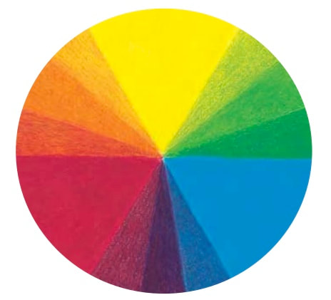
Using the above color wheels as examples, complete your own color wheel using only the primary colors.
1) You will first start with the primary colors, simply because they are the easiest and require no color mixing. Be sure to leave three empty spaces between each of the primary colors.
2) Next complete the secondary colors by mixing close to equal amounts of adjacent ( neighboring ) primary colors. They should be placed in the middle space between the two primary colors used.
3) Finally create the tertiary colors by mixing adjacent primary and secondary colors.
As you are creating your secondary and tertiary colors it is a good idea to start with your lighter colors first, and then slowly add the darker color.
As we’ve already saw in the video, tints are colors with white added. We aren’t doing this, but you would create a tint with a colored pencil by drawing with less pencil pressure, allowing the white of the paper to come through. You don’t need to draw like an angry kindergartener, but try to eliminate as much white as possible, creating highlight saturated colors. Be sure to use the same pencil pressure when creating your secondary and tertiary colors. If you don’t press hard enough you will actually be creating tints of the previous colors.
Your color wheel should look similar to the example below.
| printable-color-wheel-tertiary-colors-blank.jpg |
Color Schemes
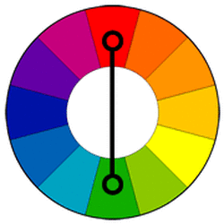
Complementary color scheme Colors that are opposite each other on the color wheel are considered to be complementary colors (example: red and green). The high contrast of complementary colors creates a vibrant look especially when used at full saturation. This color scheme must be managed well so it is not jarring. Complementary color schemes are tricky to use in large doses, but work well when you want something to stand out. Complementary colors are really bad for text. 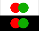
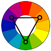
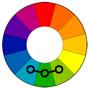
Triadic color scheme
A triadic color scheme uses colors that are evenly spaced around the color wheel. Triadic color schemes tend to be quite vibrant, even if you use pale or unsaturated versions of your hues. To use a triadic harmony successfully, the colors should be carefully balanced - let one color dominate and use the two others for accent. 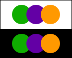
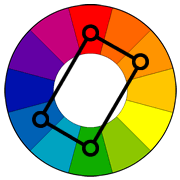
Rectangle (tetradic) color scheme
The rectangle or tetradic color scheme uses four colors arranged into two complementary pairs. This rich color scheme offers plenty of possibilities for variation. Tetradic color schemes works best if you let one color be dominant. You should also pay attention to the balance between warm and cool colors in your design. 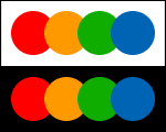
|
Analogous color scheme
Analogous color schemes use colors that are next to each other on the color wheel. They usually match well and create serene and comfortable designs. Analogous color schemes are often found in nature and are harmonious and pleasing to the eye. Make sure you have enough contrast when choosing an analogous color scheme. Choose one color to dominate, a second to support. The third color is used (along with black, white or gray) as an accent. 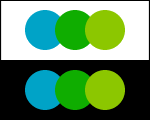
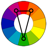
Split-Complementary color scheme
The split-complementary color scheme is a variation of the complementary color scheme. In addition to the base color, it uses the two colors adjacent to its complement. This color scheme has the same strong visual contrast as the complementary color scheme, but has less tension. The split-complimentary color scheme is often a good choice for beginners, because it is difficult to mess up. 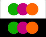
Square color scheme
The square color scheme is similar to the rectangle, but with all four colors spaced evenly around the color circle. Square color schemes works best if you let one color be dominant. You should also pay attention to the balance between warm and cool colors in your design. 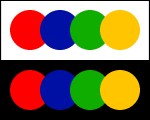
|
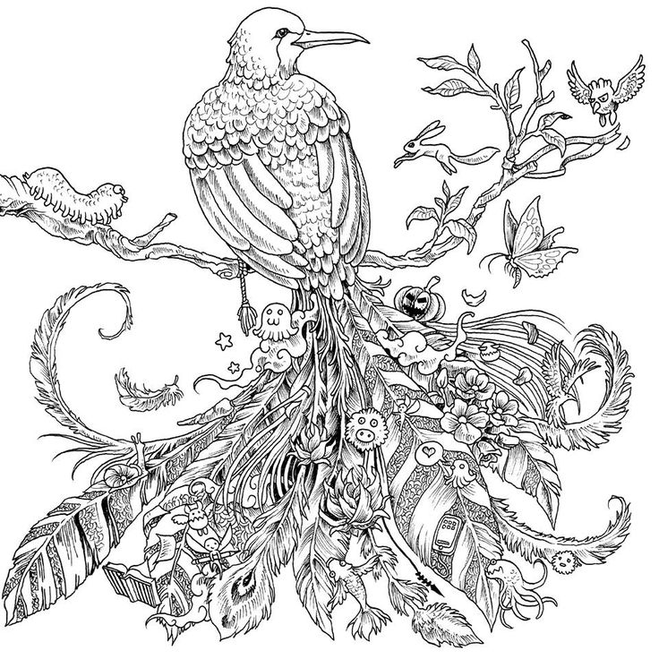
Coloring Book With Color Schemes
|
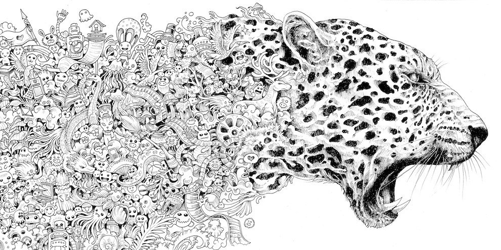
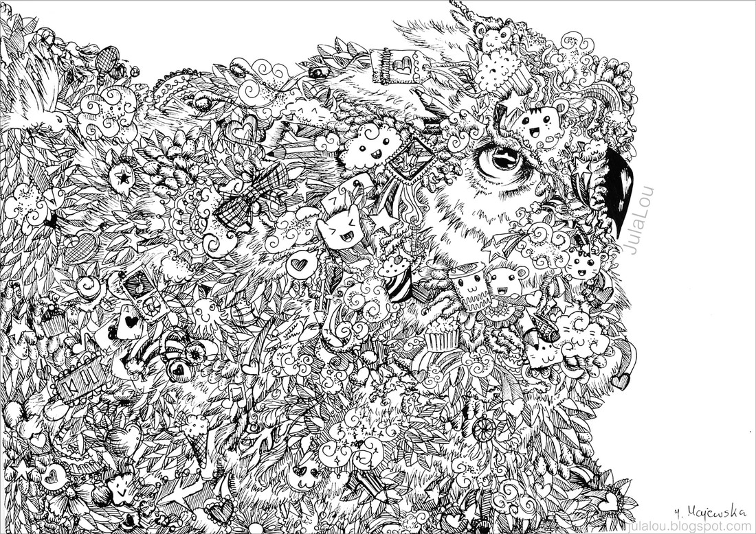
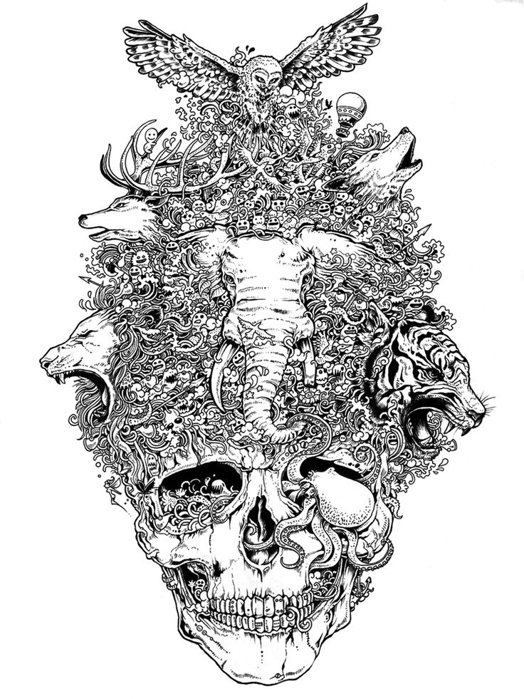
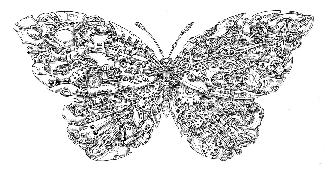
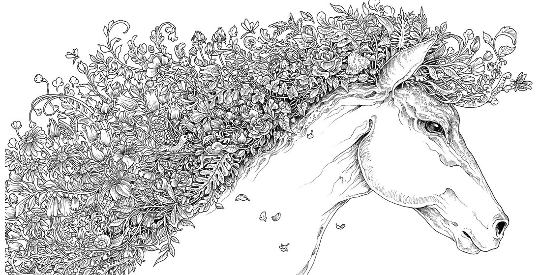
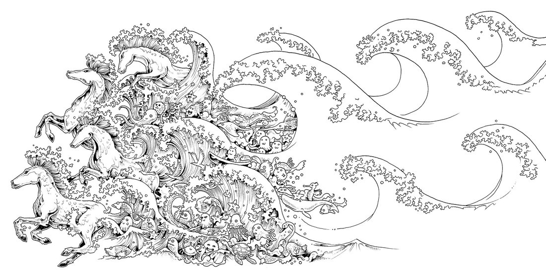
Choose one of the coloring pages from below and complete it using either Analogous, Triadic, Split-Complimentary, Rectangle or Square color schemes.
****You can not simply use complimentary color schemes**** Color Schemes Discussion | ||||||||||||||||||

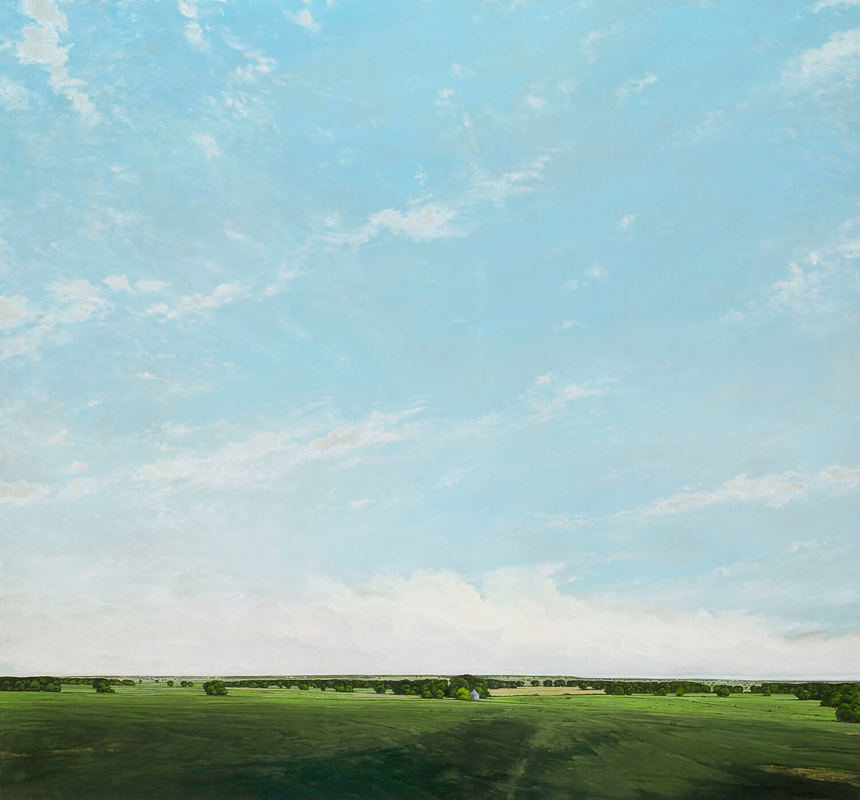
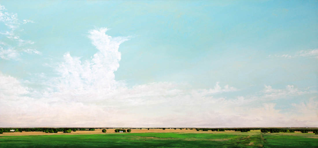
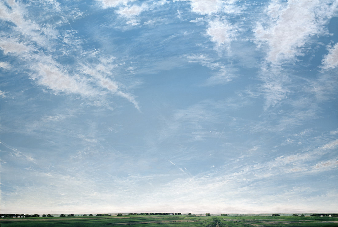
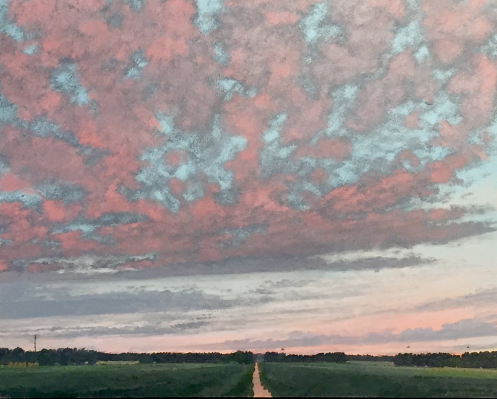
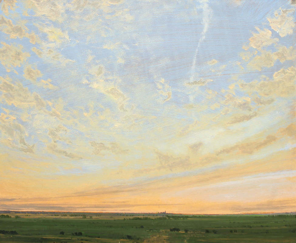
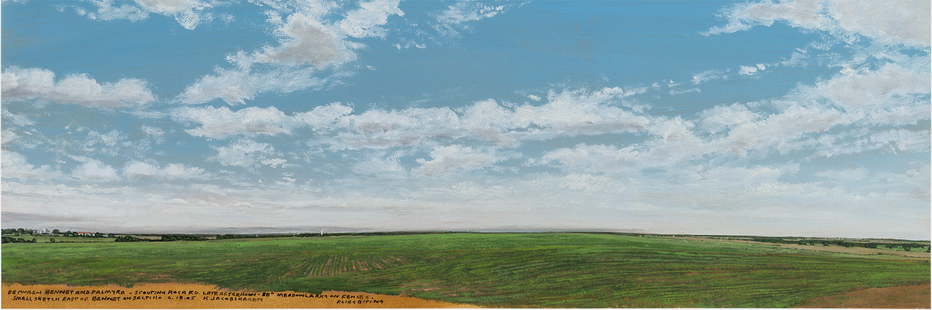
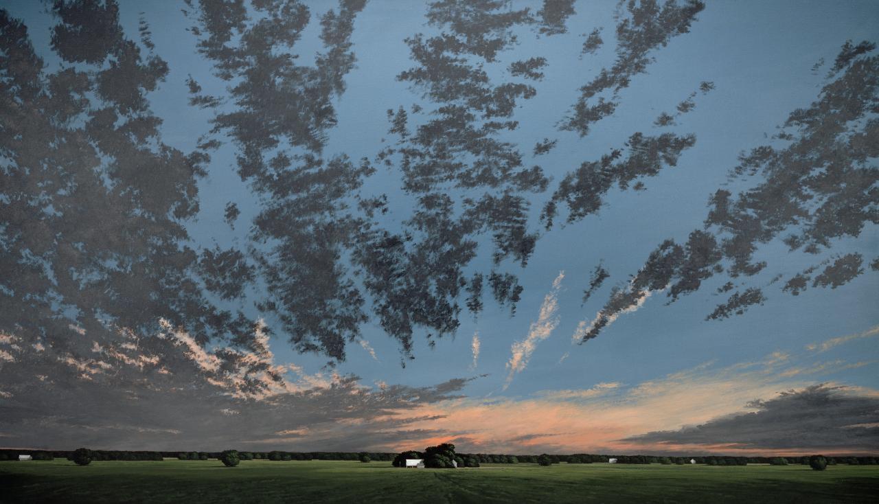
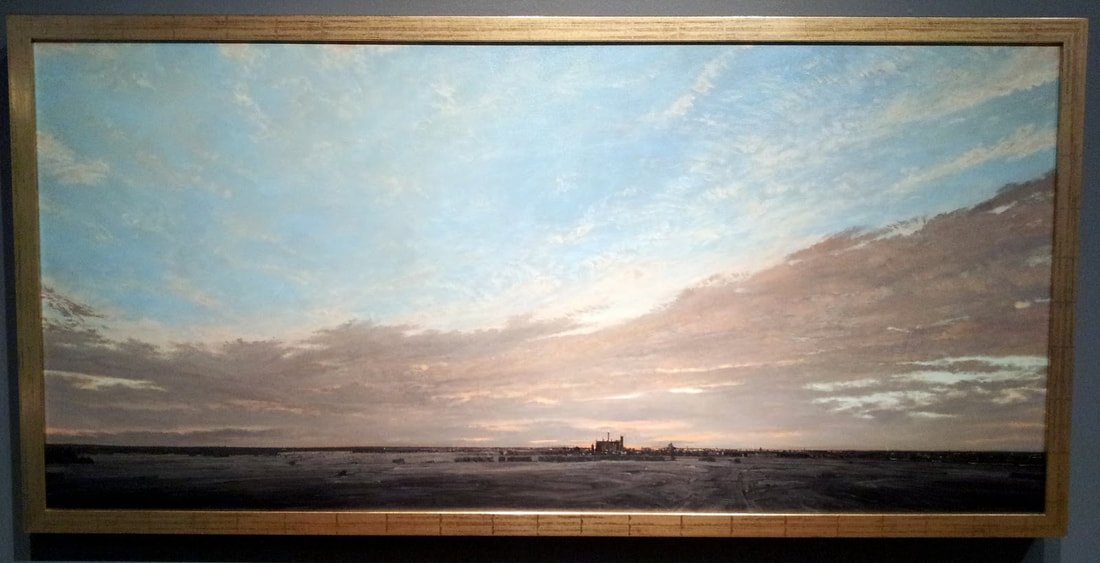
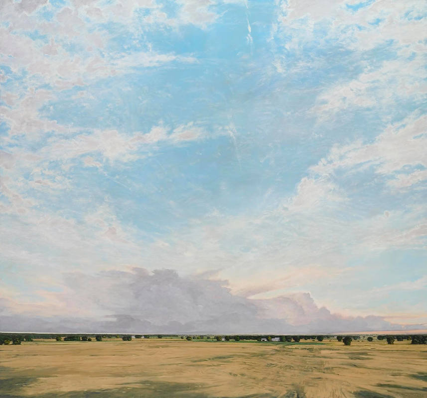
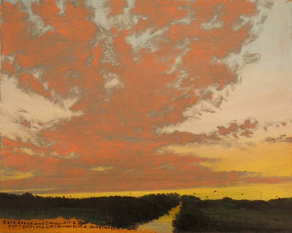
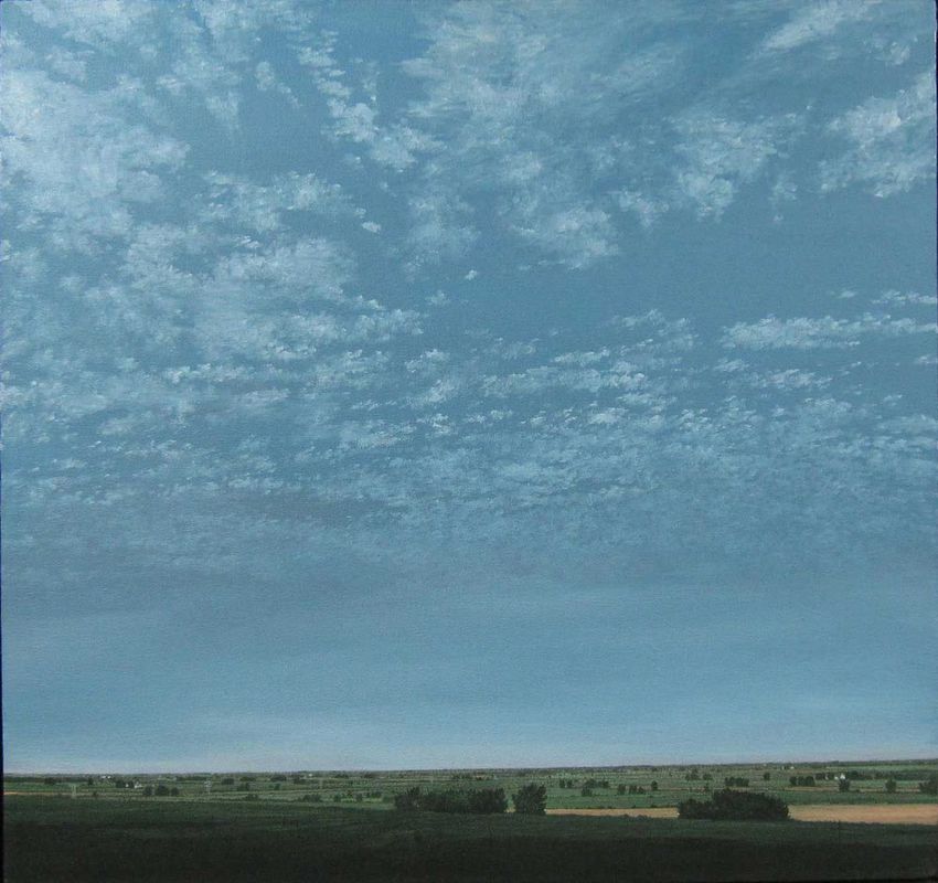
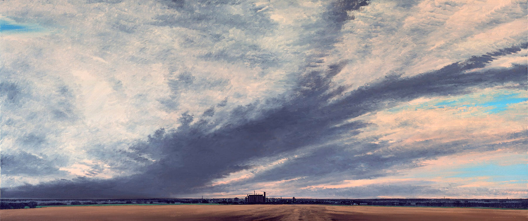
Keith Jacobshagen
|
By combining intimate reflections with a deep understanding and respect for nature, Keith Jacobshagen celebrates landscape in a manner reminiscent of the early Dutch masters. Through their trademark low horizons and wide, dominant skies, Jacobshagen’s paintings elicit a variety of emotions inspired by the Midwestern countryside.
-www.keithjacobshagen.net |
|
|
|
Where to start:
-Find a landscape with a big sky (ideally a midwest landscape, no mountains, no seascapes) -Avoid pictures of sunrise or sunset which are extremely dark (silhouettes) -Still not sure, search a place you dream of going to, or a place you've been to and you enjoy spending time at -Once you have a plan, look at multiple pictures of skies and clouds, pay attention to the color of the sky as well as reflected colors on the clouds -Start with what's farthest away |
wayne thiebaud
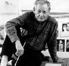
Wayne Thiebaud (born November 15, 1920) is an American painter best known for his colorful works depicting commonplace objects—pies, lipsticks, paint cans, ice cream cones, pastries, and hot dogs—as well as for his landscapes and figures. He is associated with the Pop art movement because of his interest in objects of mass culture, although his early works, executed during the fifties and sixties, slightly predate the works of the classic pop artists. Thiebaud uses heavy pigment and exaggerated colors to depict his subjects, and the well-defined shadows characteristic of advertisements are almost always included in his work.
The slideshow to the right shows various paintings from Thiebaud. Again, note the strong use of colors and shadows.
The slideshow to the right shows various paintings from Thiebaud. Again, note the strong use of colors and shadows.
Watch the videos below, and answer the corresponding questions. When you are finished, save your responses for class discussion.
|
|
|
3. Do you feel Wayne Thiebaud's food paintings qualify as fine art? Why or why not? If you didn't care what people would think, and ability wasn't a problem, what would you paint? Why would you paint it?
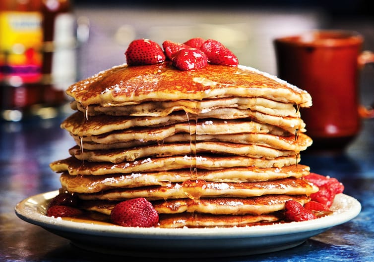
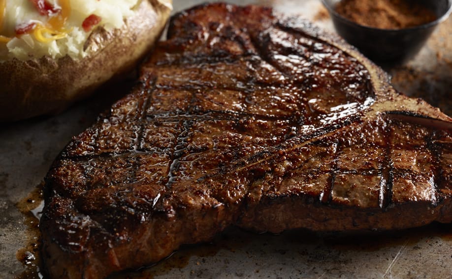
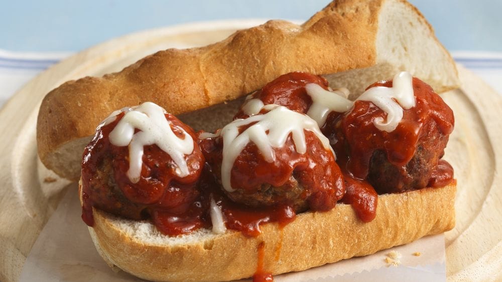
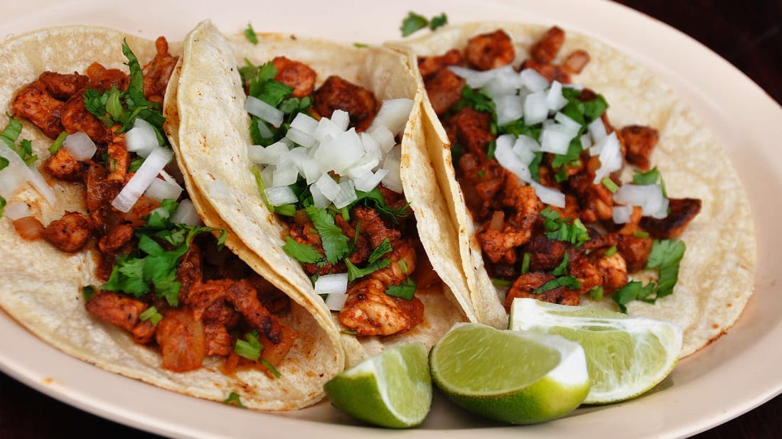
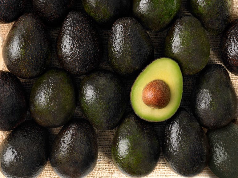
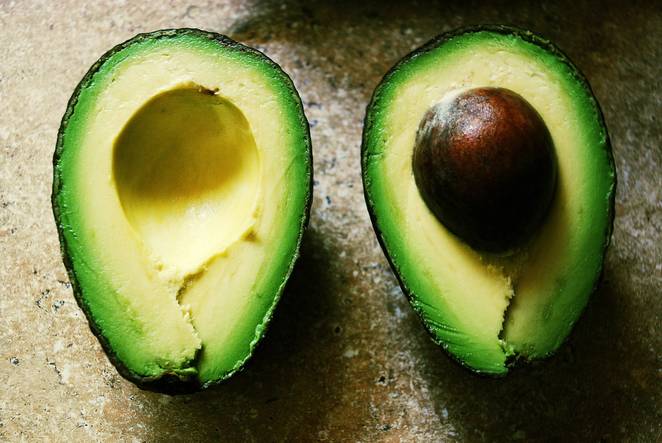
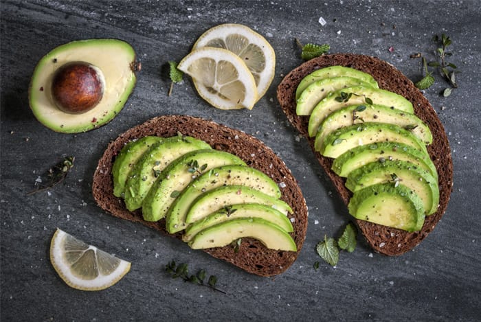
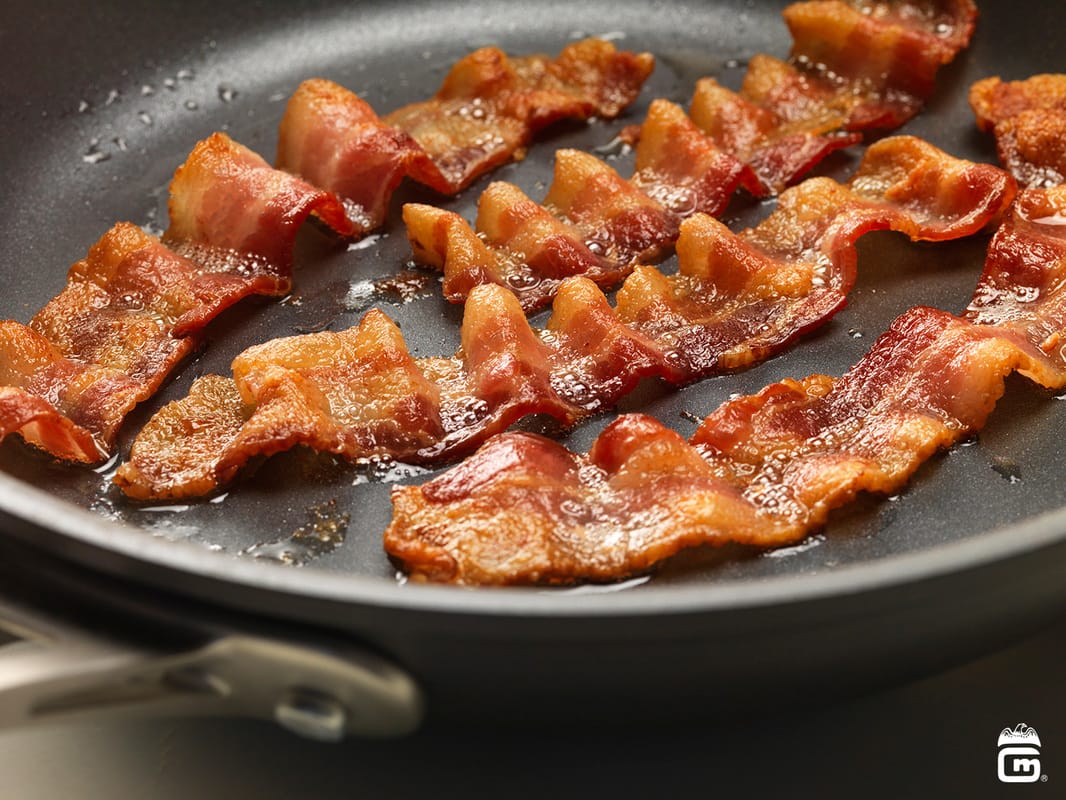
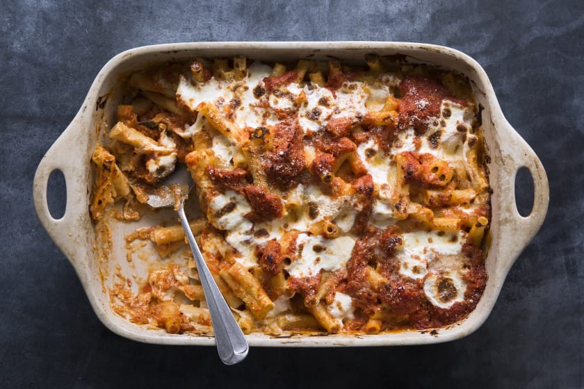
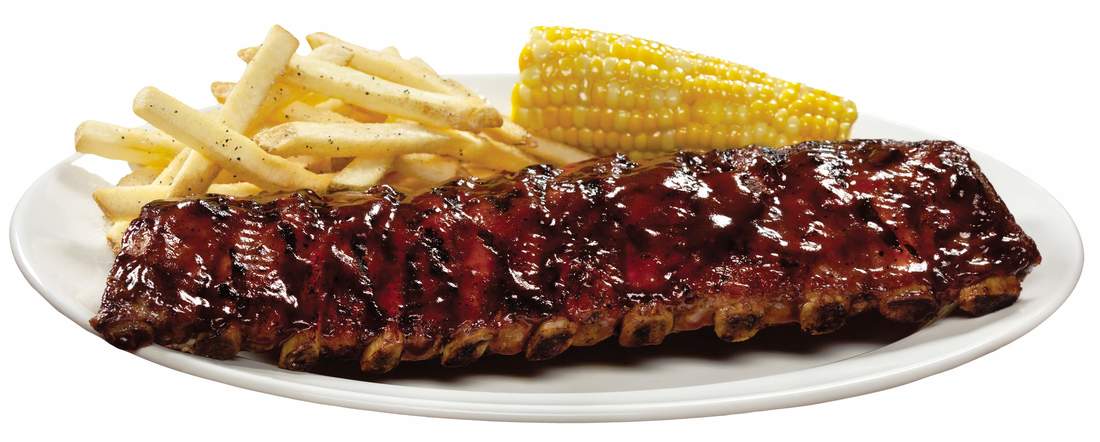
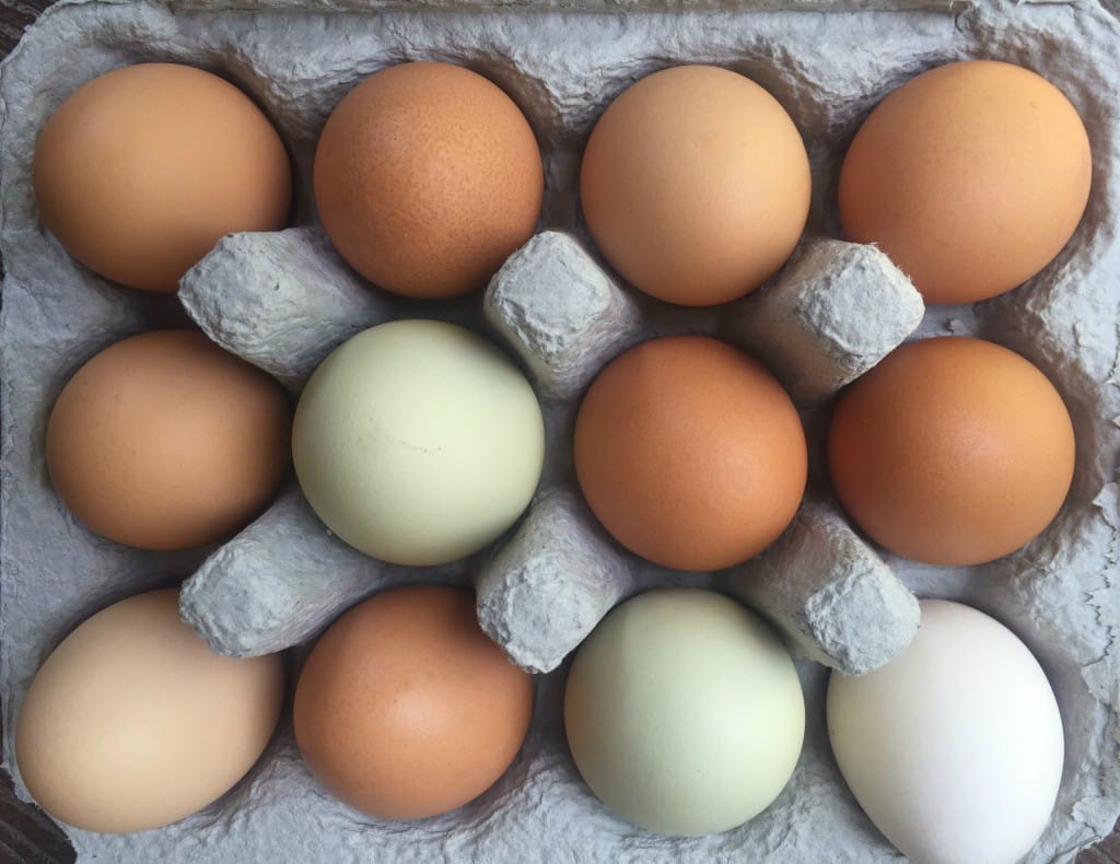
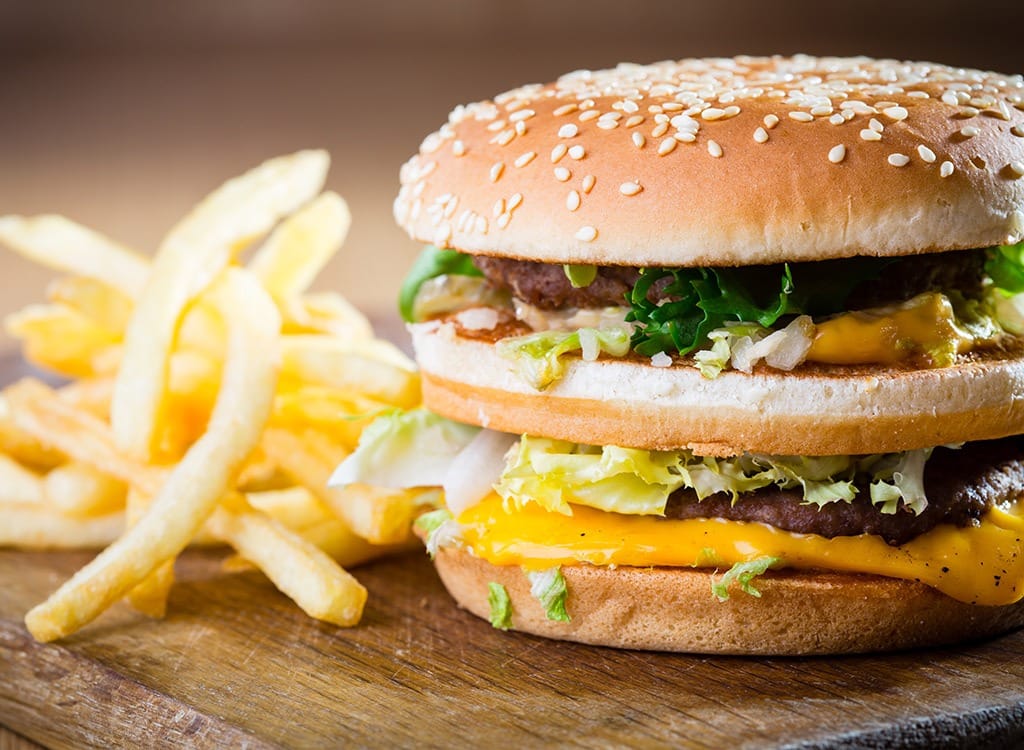
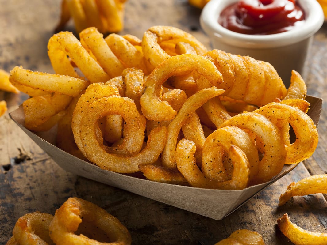
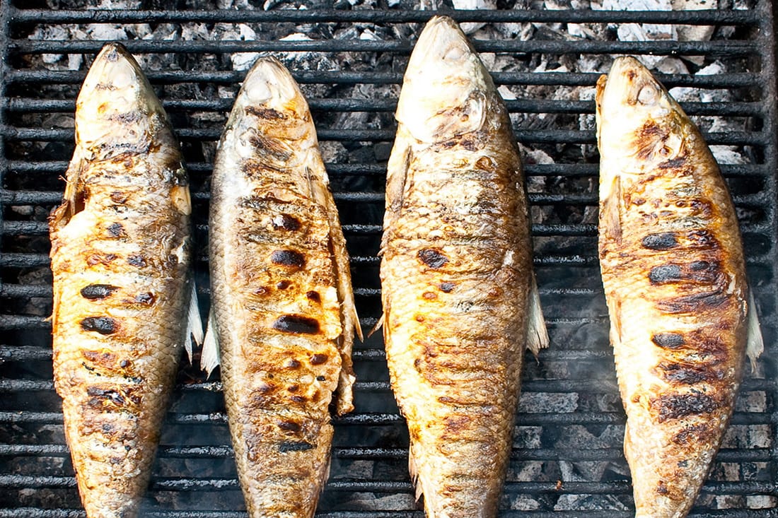
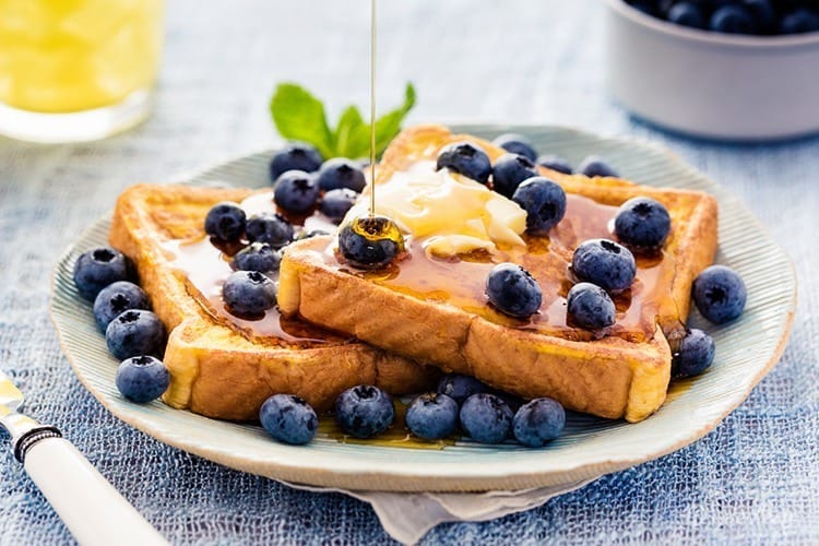
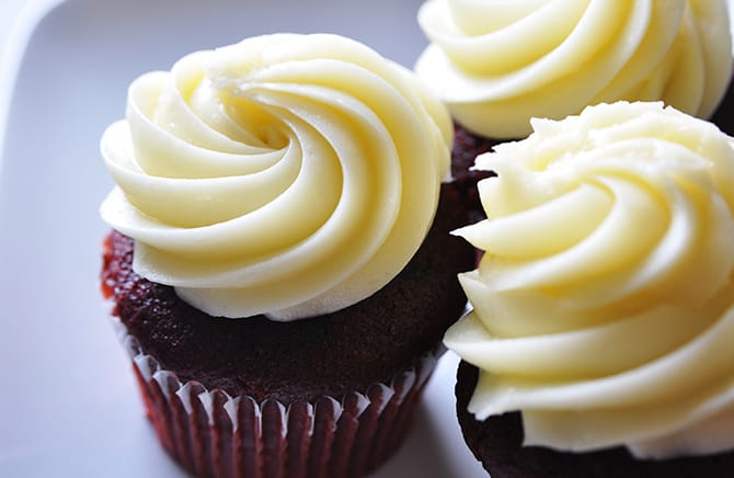
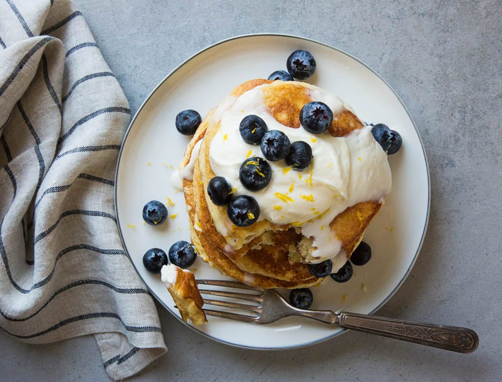
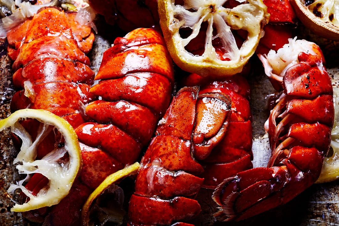
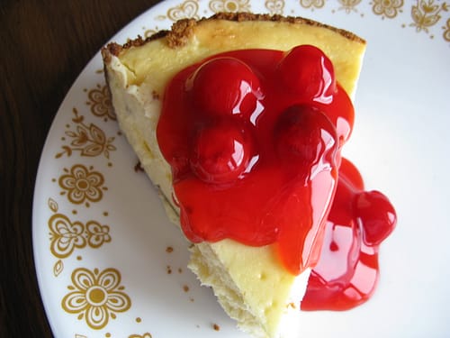
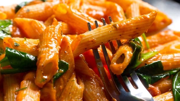
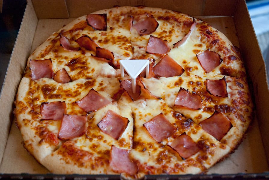
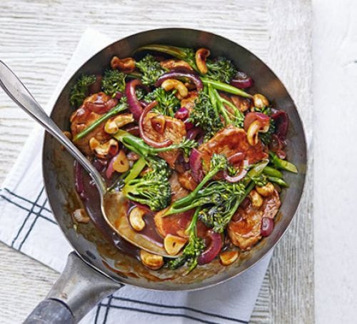
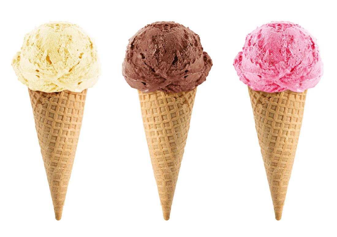
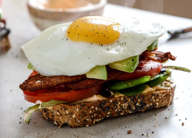
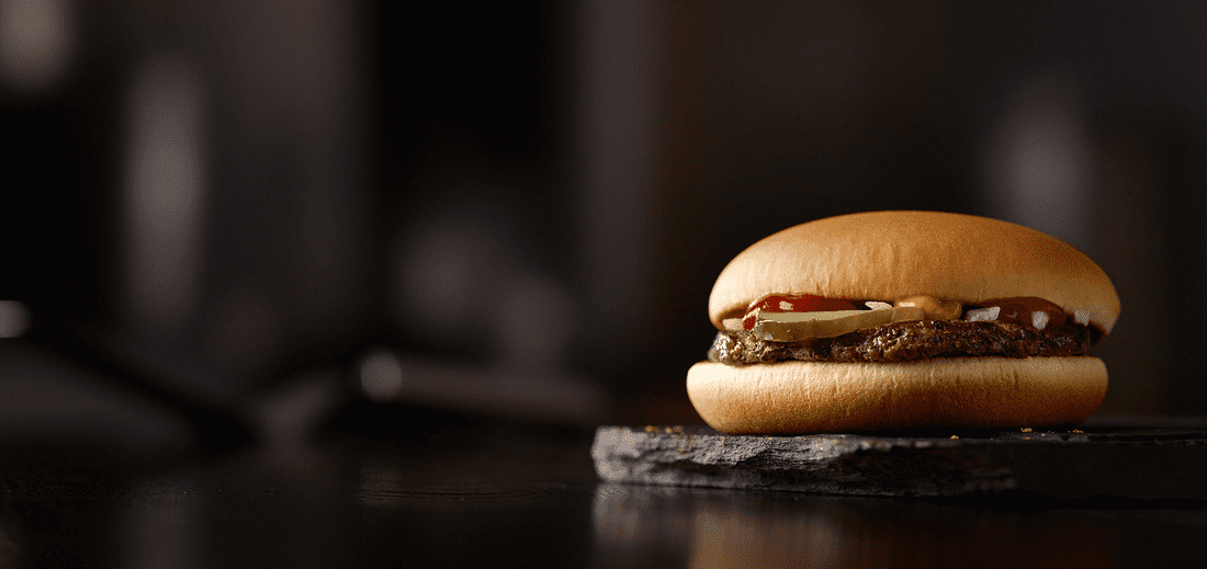
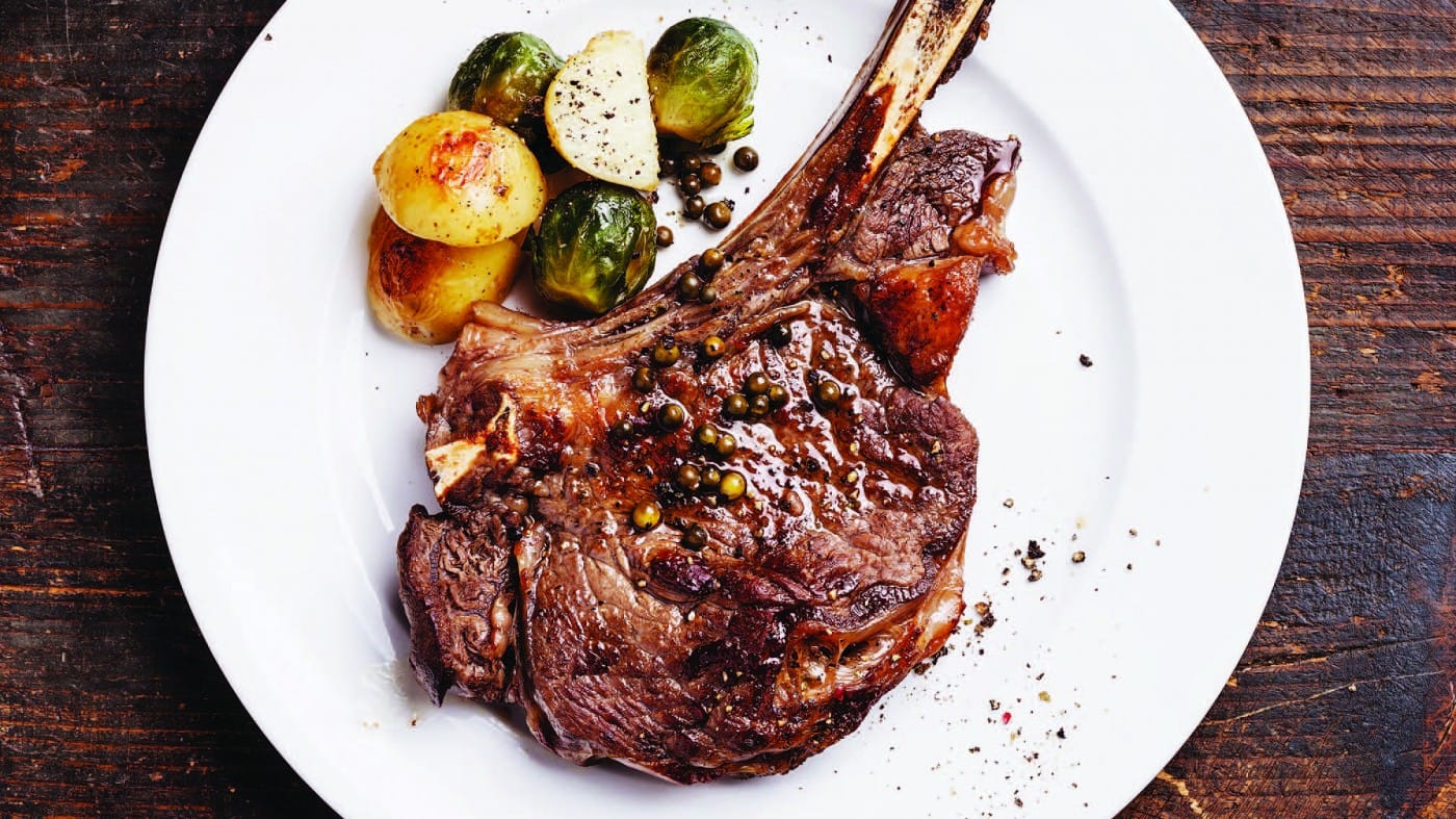
ACRYLIC FOOD PAINTING
Similar to the works of Thiebaud, you will be painting your very own food painting. From the images below, choose your favorite.


|
|
|
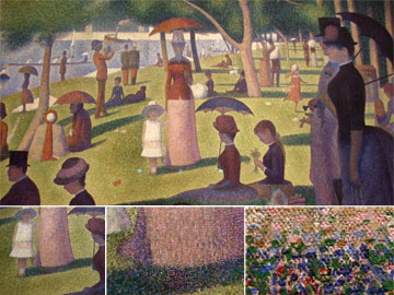
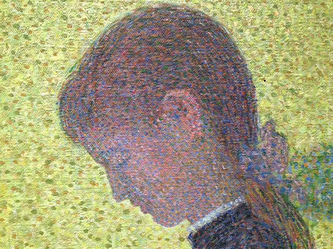
Pointillism-Georges Seurat
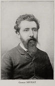
Georges Seurat was a French Post-Impressionist painter. He is noted for his innovative use of drawing media and for devising the painting techniques known as chromoluminarism and pointillism. Seurat's artistic personality was compounded of qualities which are usually supposed to be opposed and incompatible: on the one hand, his extreme and delicate sensibility; on the other, a passion for logical abstraction and an almost mathematical precision of mind. His large-scale work, A Sunday Afternoon on the Island of La Grande Jatte, altered the direction of modern art, buy initiating Neo-impressionism, and is one of the icons of late 19th-century painting.
|
|
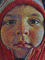
Pointillism with Primary colors
|
|
|
